A great customer survey acts as a conversation starter between a brand and its (potential) customers. Its main goal is to deliver great customer insights but just like more traditional corporate communication channels it also serves brand equity. Furthermore, a branded survey drives response rates and makes for more reliable results. This article will explore in detail some essential customer survey design aspects to leverage your survey.
Why is visual appeal important for a survey?
Every piece of content delivered for your customers, such as a blog article, a newsletter or an ad, has to meet certain visual standards that are in line with your communication strategy. For surveys, the same rules apply. From the logo to the font to the tone of voice, your survey has to match the rest of your corporate communication so your customers immediately recognize your brand. A recognizable visual look exudes trustworthiness and this, in turn, has a positive impact on the response rate of the survey.
Tip: Appeal to your company’s communication department when creating a survey. They can provide great feedback on the look and feel and help you create a survey that is consistent with your brand’s visual style and tone of voice.
Below is an example of a branded survey:
No ads, please!
Ads in a survey are not to be tolerated, especially in a professional context. You want feedback from your respondents, you’re not trying to sell them anything. So keep things professional, please! We know there are a lot of survey tools out there that are free but often include tons of ads. Not only will they distract your respondents, they will also undermine the credibility of your survey and, ultimately, your brand. At CheckMarket we take this very seriously. That’s why we also offer the option to use your own domain.
The email invitation …
If you’re going to send email invitations to your respondents, make sure this too is in keeping with the brand’s visual style. However, go easy on the number of logo’s, banners and colored backgrounds as these may come across as spammy. Rather, you will want to keep your email clean and simple – just your logo, for example – and a plain background.
Tip: Having doubts about the design and layout of your email? Consider A/B testing and let the data decide for you! Here are five more tips to send better email invitations.
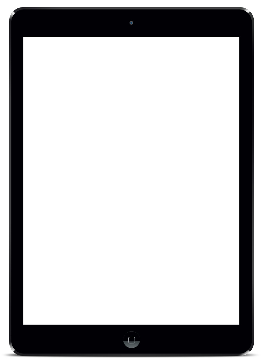
Responsive customer survey design for mobile users
One in four respondents use their phone or tablet to fill out a survey – and this number will further increase as time goes by. So make sure your questionnaire is optimized for mobile. If not, this might impact your total number of completed surveys, perhaps even rendering your data useless altogether, if you don’t reach your desired sample size.
Limit the number of questions per page
Take into account the page layout when creating a survey. Our advice? Limit the number of questions per page to avoid your respondent having to scroll to see the ‘Next’ button. The longer the page, the more difficult it becomes for your respondents to navigate, especially when they’re using their phone. So take heed …
Laisser un commentaire